Design and development of a minimalistic fashion photography website
Our design team continuously strives to develop, grow, and be ready to change. So they are constantly learning and trying new things. In 2020, Evrone designer Natasha Yankelevich decided, as an exercise, to create the concept of a personal website for an individual who inspired her - photographer Elizaveta Porodina.
Natasha published the concept on social networks and tagged Elizaveta. She almost immediately received a message from the photographer praising the site concept. Elizaveta wanted us to fully develop the site and turn it into a representation of herself and her style. We reached an agreement on all the documentary details, discussed the nuances of the fashion photography website project, and got down to work.
The challenge: to convey a creative vision to clients
Elizaveta Porodina is an international fashion photographer. She has worked with Vogue, The Cut, and GQ and has exhibited in Vienna, Berlin, and Munich. The media calls her talented and her work amazing. Her education as a clinical psychologist helps her to develop a close connection with models and get impressive results.
The website was meant to become the perfect business card and accomplish two tasks:
- present the photographer to agents and future clients
- portray her view of the work, to accurately convey the style
So, we needed to create a professional photography portfolio website that showcased Elizaveta’s work and clearly represented her vision and style. Elizaveta had clear ideas of what the photography website should look like. She did not want there to be any text about her, extensive captions for images, filters or parameters - only the display of her view of things. So that a potential client could easily visualize the final result of their task done in her style.
The solution: design that refers to the real world and physical objects
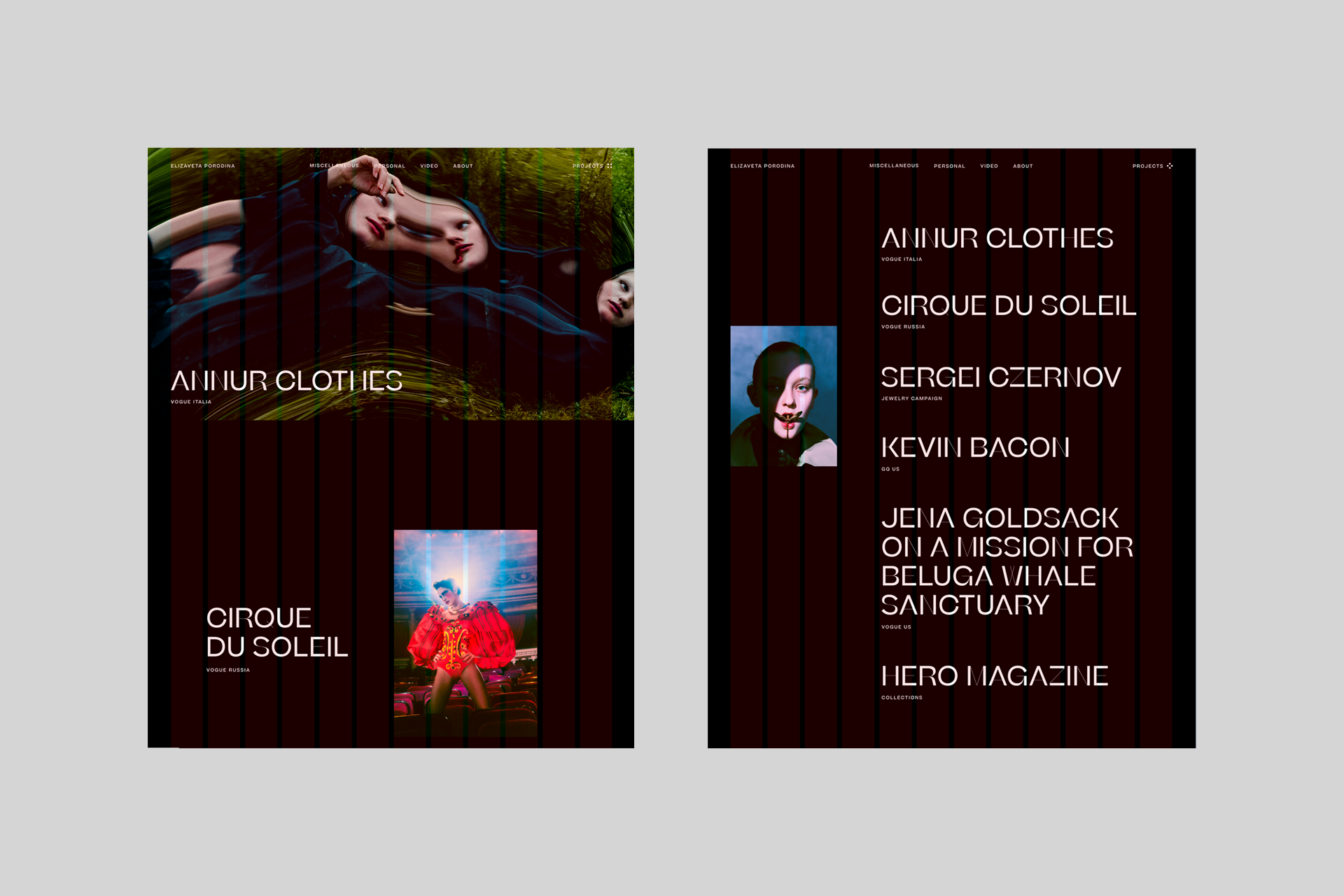
Natasha Yankelevich's “zero” concept was suitable as a starting point, but it was time-consuming in terms of layout. This style is called “a festival web.” It wins competitions, but it is not always convenient to work with.
Elizaveta also stated that she doesn't really like pages overloaded with animation, preferring clean layouts and large blocks instead. She envisioned a website closer to the physical world, more like a “book about a photographer.” Therefore, we directed our course towards simplification and making a minimalist portfolio website for fashion photographers.
First concept: borrowing layouts from magazines and newspapers
We started with a classic photographer business card site design, which is a good minimal website design example. In order to give it a "journalistic" look, we used a 12-column layout. This is the "Swiss Style" borrowed from the printed editions of the 20s. It is great for photographs and large text blocks. Layouts for these types of pages are convenient and easy, since everything is subject to a grid and simple logic.

To make it easier to navigate, we placed commercial footage on a black background, and personal footage on a white one. Super-contrasting, avant-garde font was used for the text, as this is a common feature of modern experimental magazines.
Let us create a personalized solution like Porodina’s website —contact us today to get started!
Layout rules helped to combine a series of photographs into a common visual story. We looked at minimalistic, Nordic approaches for our pro photography website inspiration, which helped create a 'printed' feel. For clients (editors, curators, producers) this is an understandable format that is easy to recognize and associate with their tasks.
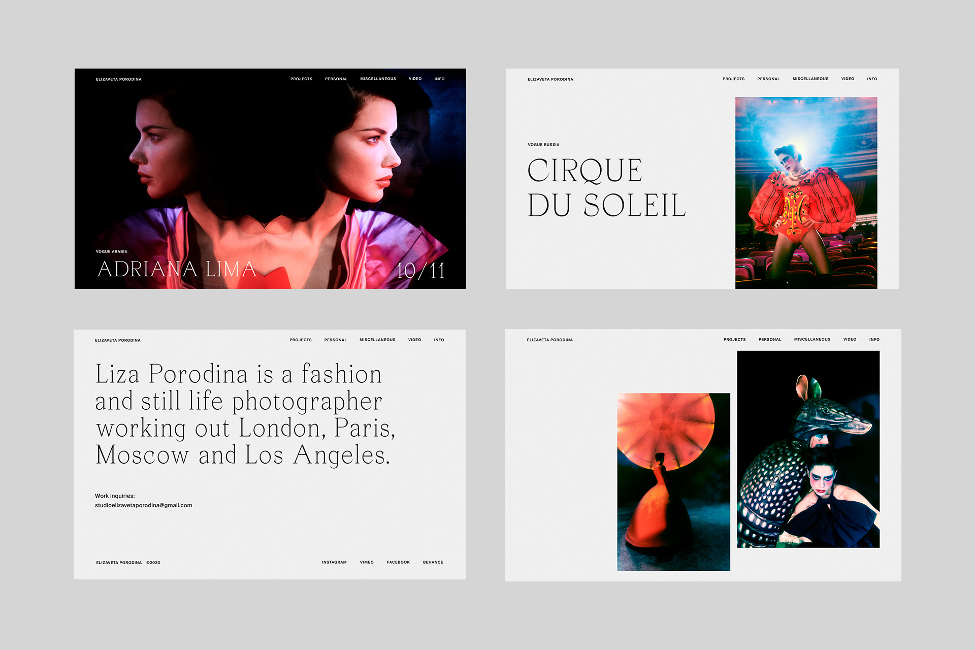
Second concept: making the website look like a real object
This design concept was born when we decided to go even further towards the physical object. Since people are used to reading pages from left to right, we made the page transition horizontal, so it's close to interacting with a real book or magazine.
Photos became larger, filling the space. On the main page, we again used a black background, but this time for more contrast and to direct focus on the images. Color dualism transformed the series into booklets with dark covers and light pages.

We also used a less contrasting, sleek font in the spirit of the classic, glossy Vogue magazine, to make the text feel like a headline. The presentation of these two concepts helped shape the requirements and taught us more about how to create a photography website. We clarified user scenarios and came up with the following features for the photography site:
Instead of black and white, we decided to use only light colors for a greater "papery" sense, as well as to avoid dividing projects into commercial and personal, because both are works of art. We dropped the massive accent fonts, so that the text would not draw attention to itself.
We removed navigation, so as not to distract users from viewing. Moved away from a non-standard creative layout. While it allows you to control the viewer's attention, it is very difficult to decide which works should be shown large and which should be shown small and to the side. Instead, we decided to use a more understandable hierarchy with the main focus at the beginning and the secondary at the end.
The "About the Author" block was replaced with a block with contacts. Elizaveta wanted the photos to speak for her, with no description needed.
Third concept: rejecting the superfluous
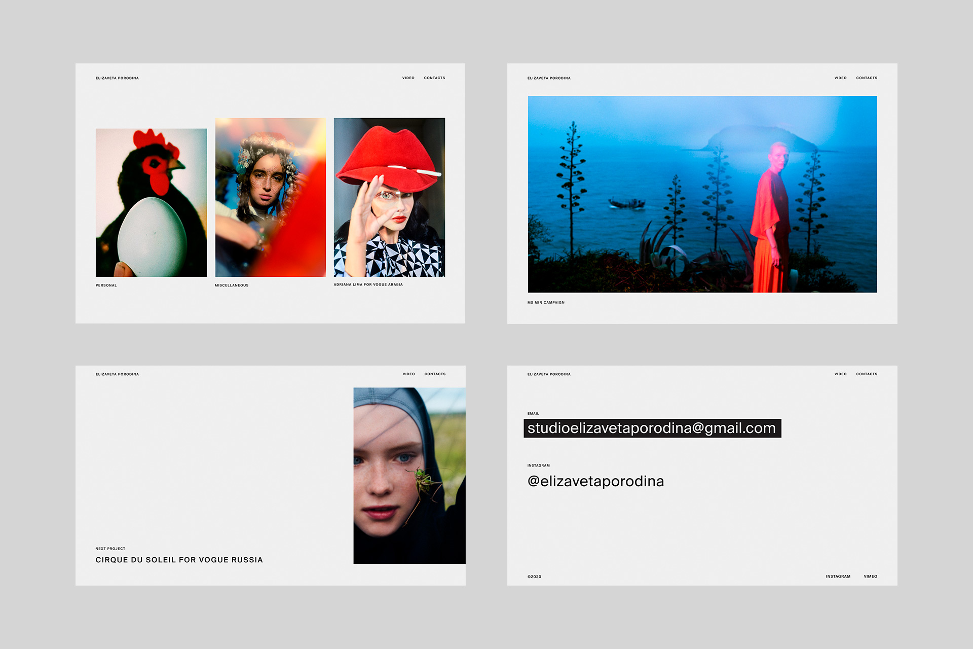
This concept is based on the "content is king" principle. Each photo was given as much space as needed to impress the user.
The main page scrolls from top to bottom, so you can quickly navigate and find what catches your eye. In contrast, the photo series features a horizontal, page-by-page scroll. This is a reference to magazines, books, and exhibitions in galleries and museums.

Links to videos and contacts remained in the navigation, and there are no complications or drop-down menus. The categories also disappeared. Many people feel that when you have a lot of material, it must be divided by topic. Instead, at the request of the author, we balanced the objects with one other.
In the first concepts, we focused on the name of the series and the brand, since the site was meant to fulfill a promotional function. In the final concept, we shifted the emphasis to the impression of images.
Despite the fact that the layout is quite strict, we managed to add freedom and character to it. Series previews can have different aspect ratios, but we didn't fit them to the same size, as this would lead to unnecessary stereotypes. Instead, we allowed them to have different heights and widths, which gave them more movement.
To make classic typography come alive, we animated links, but this can only be seen on hover. Such a detail, imperceptible at first glance, pleasantly surprises and catches the eye.
Abandoning the backend and admin panel
New series of photos appear infrequently, about once every 2 months. The old ones are deleted and only the current are available. Since there is no need to store files in large quantities and downloads are rare, we decided to abandon the admin panel and backend. Updates are downloaded by our developer when needed.
To create the website, we chose the Vue.js framework, because it withstands loads well and provides ample opportunities for customizing the design, and code can be written quickly on it. To add SEO parameters, we used Nuxt.js.
Using React could be an alternative in this case, but it would take more effort to create a minimalistic portfolio site with it, while Vue.js has many of the necessary functions available (router, vuex, ssr). If we need any additional functions, we can connect them as plugins, since Vue.js has an active and lively community that shares different solutions.
"Nothing distracts the users from the photos, and I'm happy with that."
The development of several concepts helped us determine the boundaries of what is difficult to understand and what is clear and precise. This is an important point of communication, because what is obvious to the designer may not be clear to the viewer.
Our goal was to have Elizaveta love her website and want to show it to others and share it on social networks. After all, her site would be a representation of herself, a portrayal of her thoughts and emotions.
While you can only evaluate the effectiveness of a photographer's portfolio site by how well it works in the long run, our key metric right now is the personal perception of the client.
We are proud to have Elizaveta Porodina website design listed in the Top 10 Photography Website Designs by DesignRush. And this is how our work was evaluated: