Supporting UI and UX Design for an Investment Platform
In this article, we’ll share how we assisted our long-term client, the investment platform "Potok," with their interface redesign, created a Fintech UI-kit, and added new features to the interface.
Potok is an investment platform that enables small and medium-sized businesses to attract investments or take out loans. Both individuals and legal entities can become investors. According to the company’s data, over 346,000 businesses have been assessed, and the platform currently has more than 135,000 investors.
Potok is one of our long-term clients, and we initially assisted them with development, which we discussed in detail in another article. When the client needed help with design, they reached out to Evrone again. After successfully completing a test assignment, we began collaborating on design work as well.
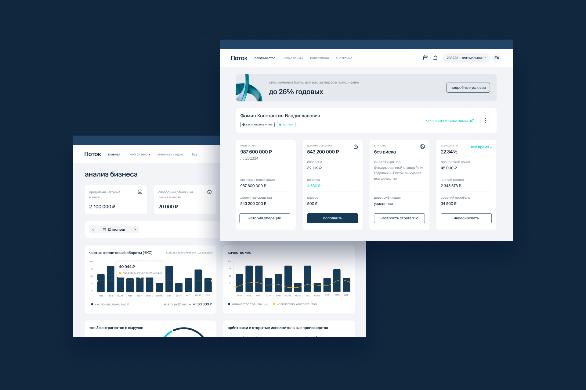
Investor Dashboard Redesign
Recently, the platform updated its brand identity, which was developed by an external company. We helped integrate the new branding into the platform and redesigned the user interfaces. The client wanted more than just a color and font update—they aimed to improve the overall user experience.
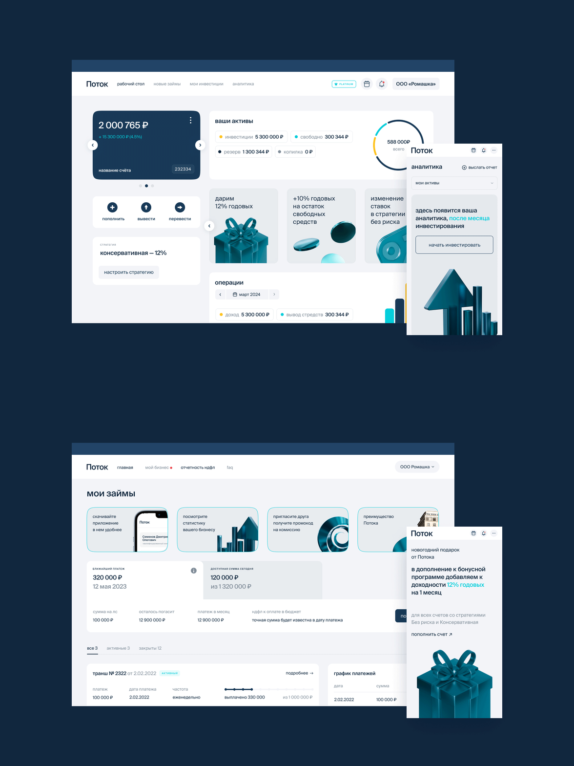
The changes started with the investor homepage. We proposed a block system that helped structure the information on the page. Now, investors can immediately see their available funds and how much money they have in their "savings." Clear call-to-action buttons, such as "buy" and "top up," were added.
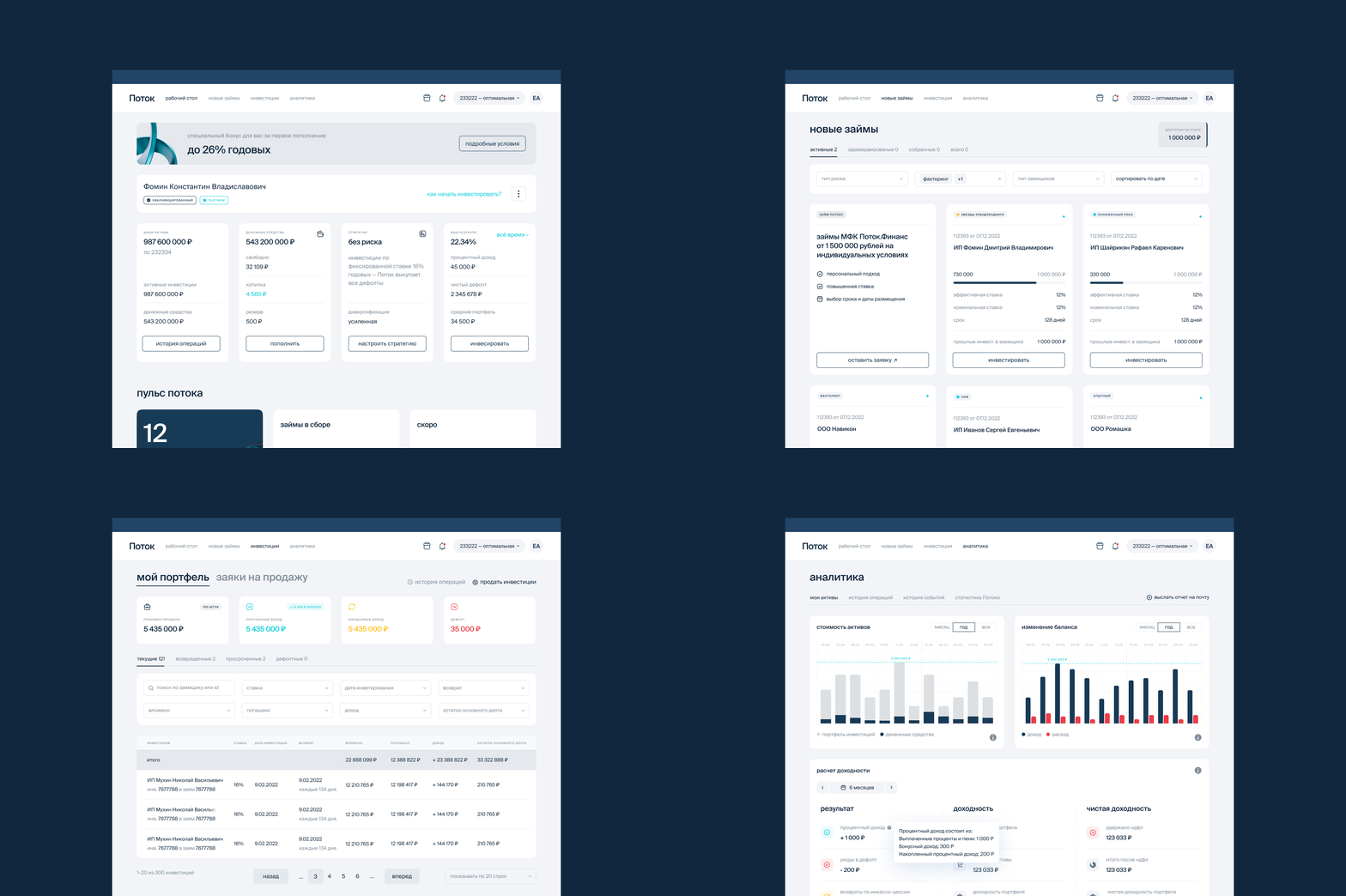
Additionally, investors now have a new section with investment options. Previously, the list of companies was presented in a table format, but we redesigned it as cards, making the information easier to digest and visually appealing.
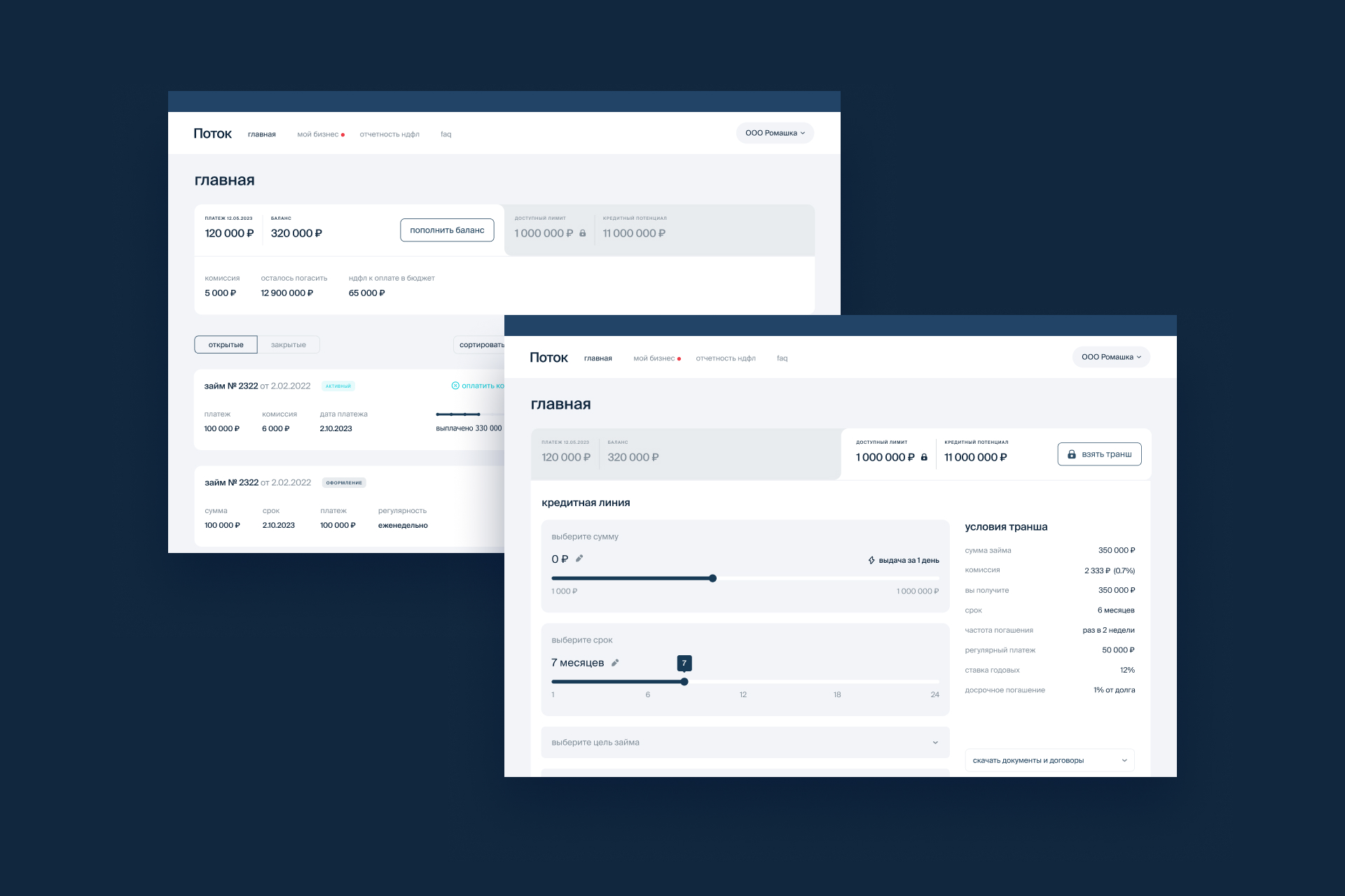
Borrower Dashboard Redesign
Simultaneously, we redesigned the interfaces for borrowers. Our task was to create a new UX design for the fintech platform, as the borrower interface didn’t even have a frontend originally—everything was rendered on the backend. Loans and investments are two separate systems, but we decided to unify them with a consistent design. First, because some clients may fall into both categories, and second, it simplifies the design process and makes integrating new features easier.
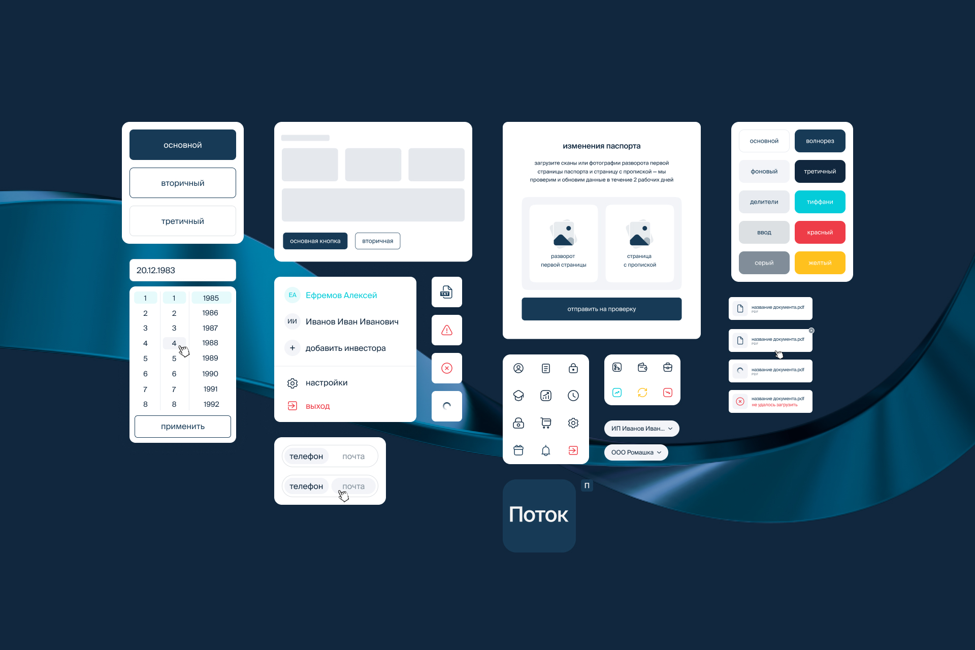
UI Kit
During the redesign, we began assembling a UI kit, which the platform previously lacked. This kit includes interface elements such as buttons, icons, lists, input fields, etc. Our designers worked on this in parallel with revamping the pages—deciding which elements to remove, which to keep, and which could be reused on other pages. This greatly simplified future work for both the design and frontend teams.
Onboarding Design
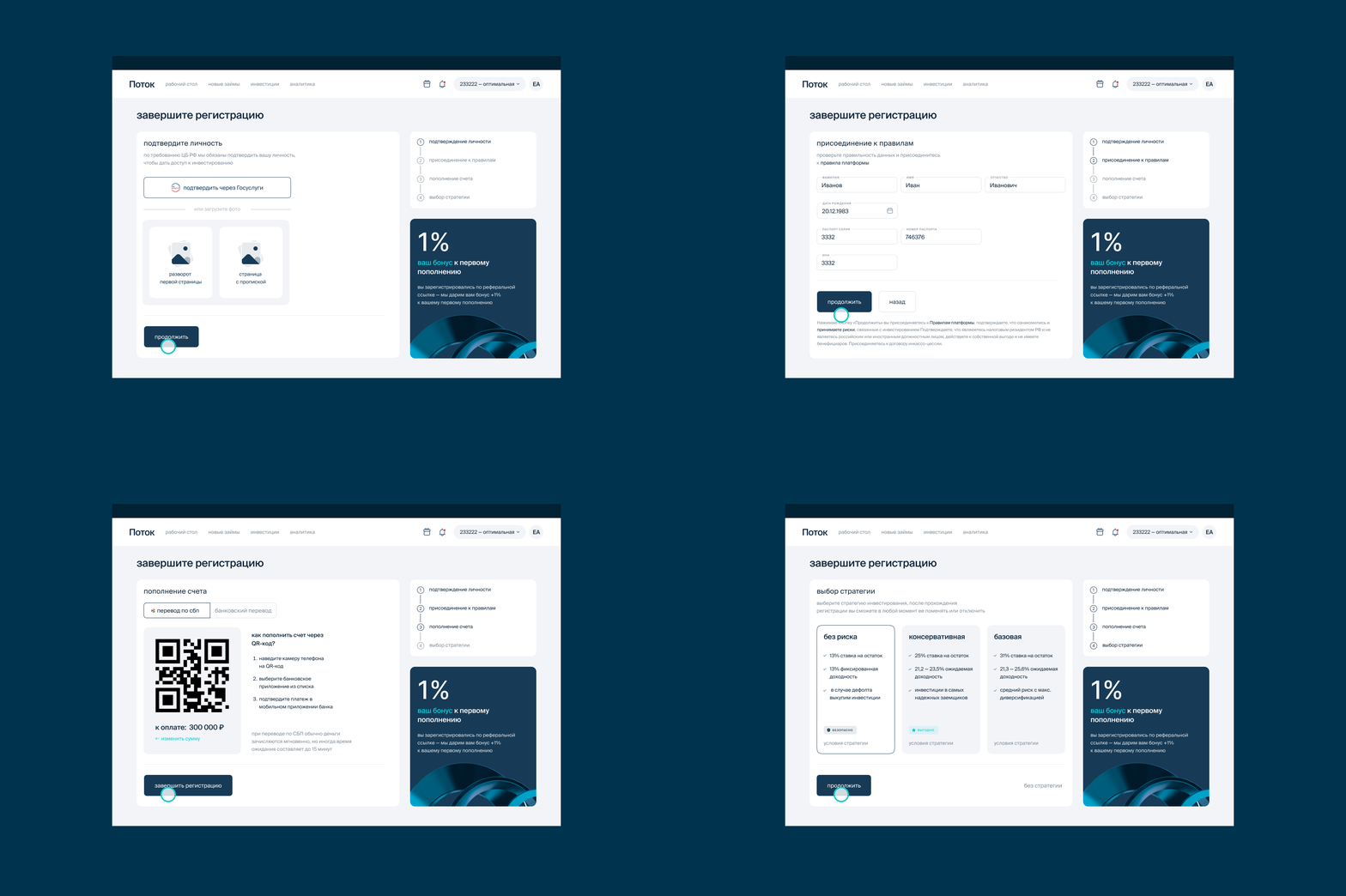
As part of the redesign, we also simplified the registration process for both investors and borrowers. The investor onboarding process is divided into three steps, allowing users to see what they need to do to fully use the service: upload an ID, sign documents, and top up their account. Required documents can also be uploaded via the government services portal (Gosuslugi).
For borrowers, the process is a bit longer and more complex. The first step involves uploading a financial statement, with available statements automatically highlighted and any document errors flagged. The next step is a detailed questionnaire, which we broke down into groups: legal entity information, individual information, and passport data. As users fill out the form, they can see the next steps and have the option to complete the process in stages. After completing the questionnaire, borrowers access a calculator showing the loan terms they qualify for. A standard bank slider is also integrated into the page, allowing users to adjust inputs and see how the terms change in real-time.
The borrower interface has two main tabs. The first is the calculator, where users can apply for a new loan. The second displays current loans, even if there are none yet, so that users know where to find this information in the future.
Mobile App
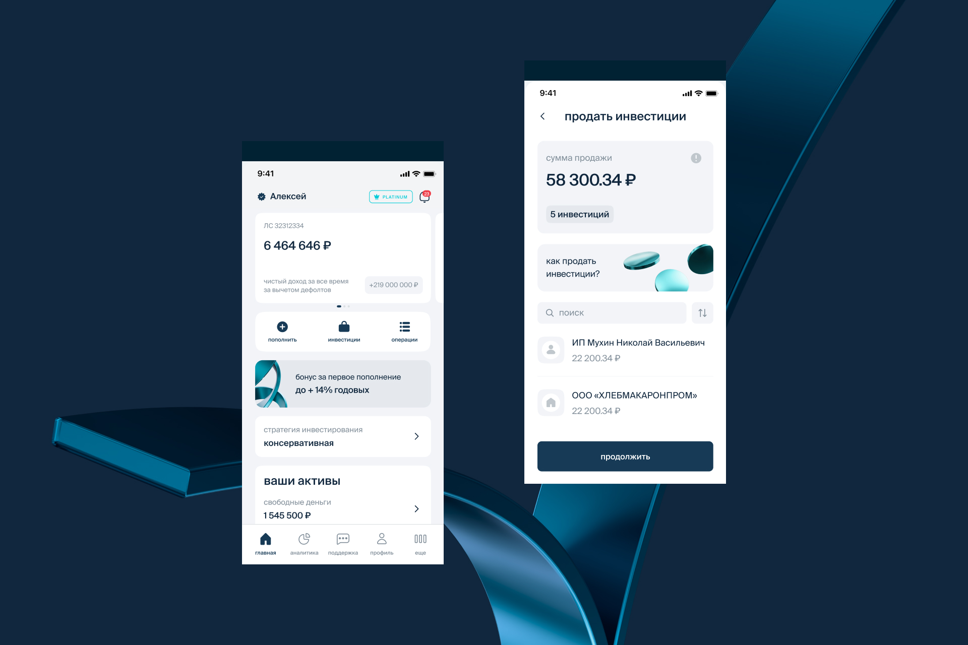
The mobile app is available only for investors and is built on Flutter by an external company. The client developed the technical specifications themselves but brought us in to provide detailed feedback to the contractor. Our specialists consulted the contractor’s designers during the concept development phase and provided a review. The app is now live, and its design support is also handled by Evrone specialists.
Agent Platform
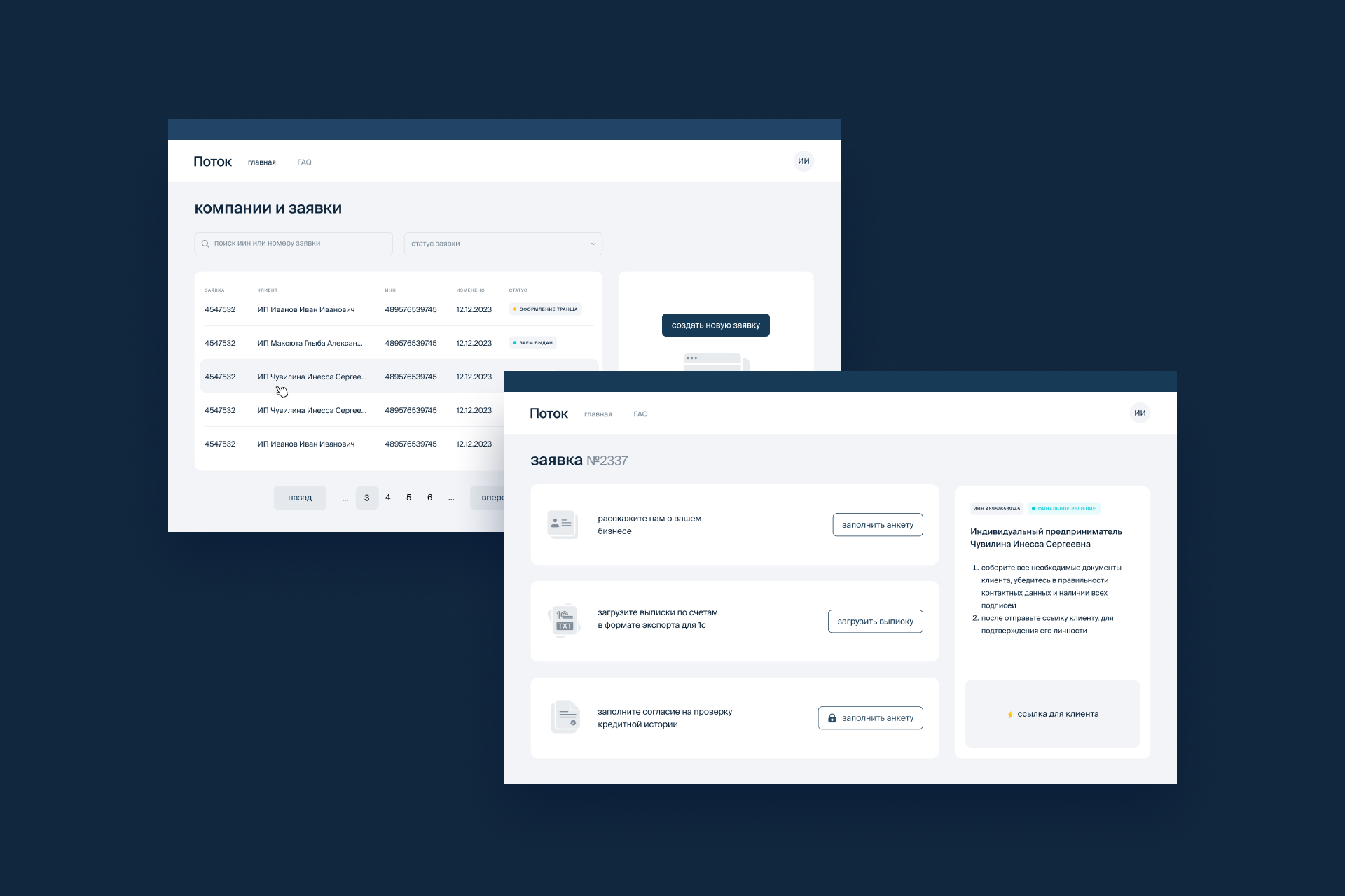
One of Potok’s latest innovations is the agent platform. These are users who act on behalf of multiple borrowers and assist them in applying for loans. We developed the interface for these users based on the borrower interfaces. Initially, we planned to use a block system for agents as well, but we quickly realized that with so many clients, a table format would be more practical. The table shows all the statuses of current transactions, and clicking on them leads to a detailed card view. This view shows whether documents are signed, the questionnaire is complete, and the stage of processing. Often, agents fill out the questionnaire and attach documents on behalf of the client, who only needs to sign them. A signature link is provided, which agents can easily find and send to the client—this element was designed to be prominent in the interface for quick access.
Future Plans
We continue to work on the project, with most of our tasks focused on adding new features to the interface for various user groups.
Among the major updates, there are plans to introduce new features for investors. These include adding histories and news feeds, similar to those found in banking apps. Mockups have already been developed. Overall, the platform is moving toward a more “bank-like” interface, where users will easily see multiple accounts, switch between them, and assign custom names. This will make the platform even more intuitive for users, as most people are already familiar with UX design in banking.
Are you looking for an experienced design team to help create a compelling UI/UX for your fintech application? Fill out the form below, and Evrone’s managers will get in touch with you to discuss your idea and share our expertise.