Principal at VSUFT
Uniting the past and future to build corporate identity in the higher education
Read our new case study about the examples of corporate identity in the higher education sector. Evrone helped Voronezh State University of Forestry and Technologies to rethink the university branding and update their logo and identity.
February 2021
5 mins
Voronezh State University of Forestry and Technologies trains specialists in forestry, woodworking, automation, economics, design, and other areas. In 2020, the university celebrated its 90th anniversary, and in honor of this, management decided to rethink the university branding and update their logo. The new symbol needed to be more modern, while still referring to the experience and knowledge gained over the years.
The task
The previous logo of the university was 10 years old and outdated. So, a new graphic was required, something more dynamic and suitable for a variety of uses, but still recognizable. It needed to both demonstrate the high status of the university in scientific circles and look appropriate on student gear.
Management was open to any new ideas for their higher education branding, so our design team was completely free to suggest anything from classic to avant-garde options.
The solution
We developed 4 versions of the new VSUFT logo, each of which carried an idea associated with the university. Each version was completely ready for development into a full-fledged identity, as the designers had examined the role of corporate identity in university branding and carefully considered the use of the symbols in different situations and media forms.
1. Rings
Tree rings were the inspiration for this logo. As a tree lives, accumulating strength year after year, so the university has developed, accumulating new knowledge and experience.
The logo is easily transformed, becoming a pattern or a three-dimensional figure, while still remaining recognizable.
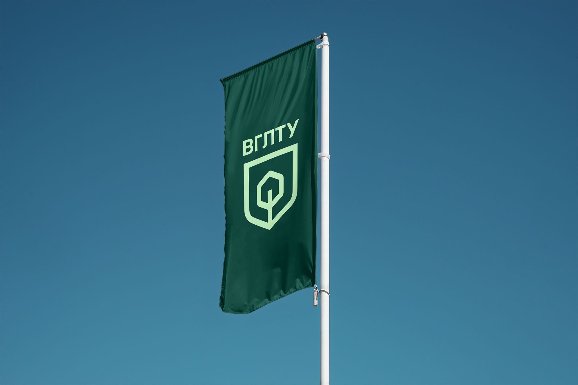
2. Shield
Here, the design team turned to the classic university symbol - the heraldic shield. It was simplified and combined with the silhouettes of a tree and gears. The balance between minimalism and recognizability is a reference to the balance of the historical and the modern.
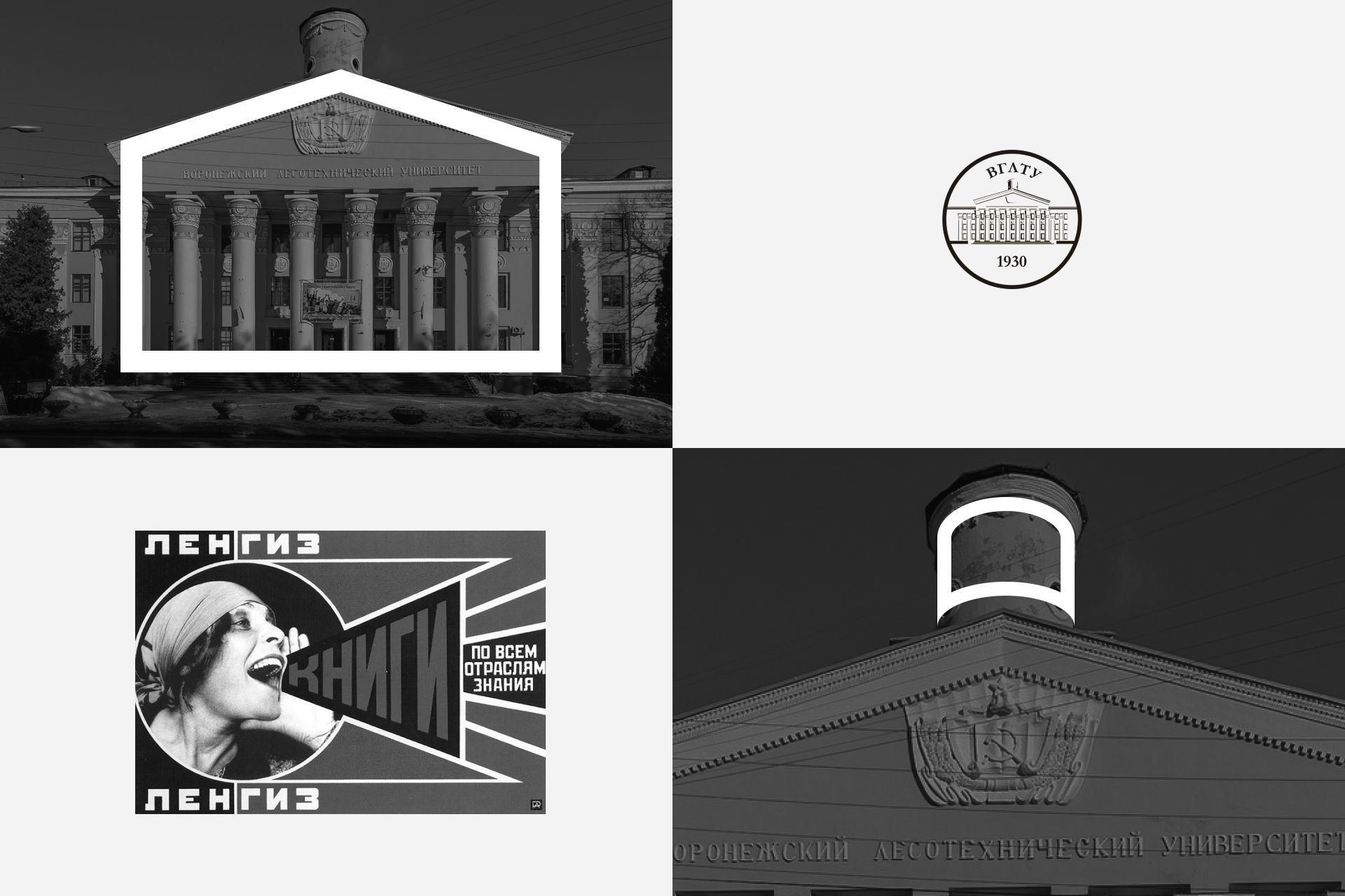
3. Evolution
This symmetrical sign, in the form of the main VSUFT building, looks open and is complemented by the pages of a book and a pictogram of a plant. Together, these symbols imply that the university inherits and preserves traditions, but is open to new things.

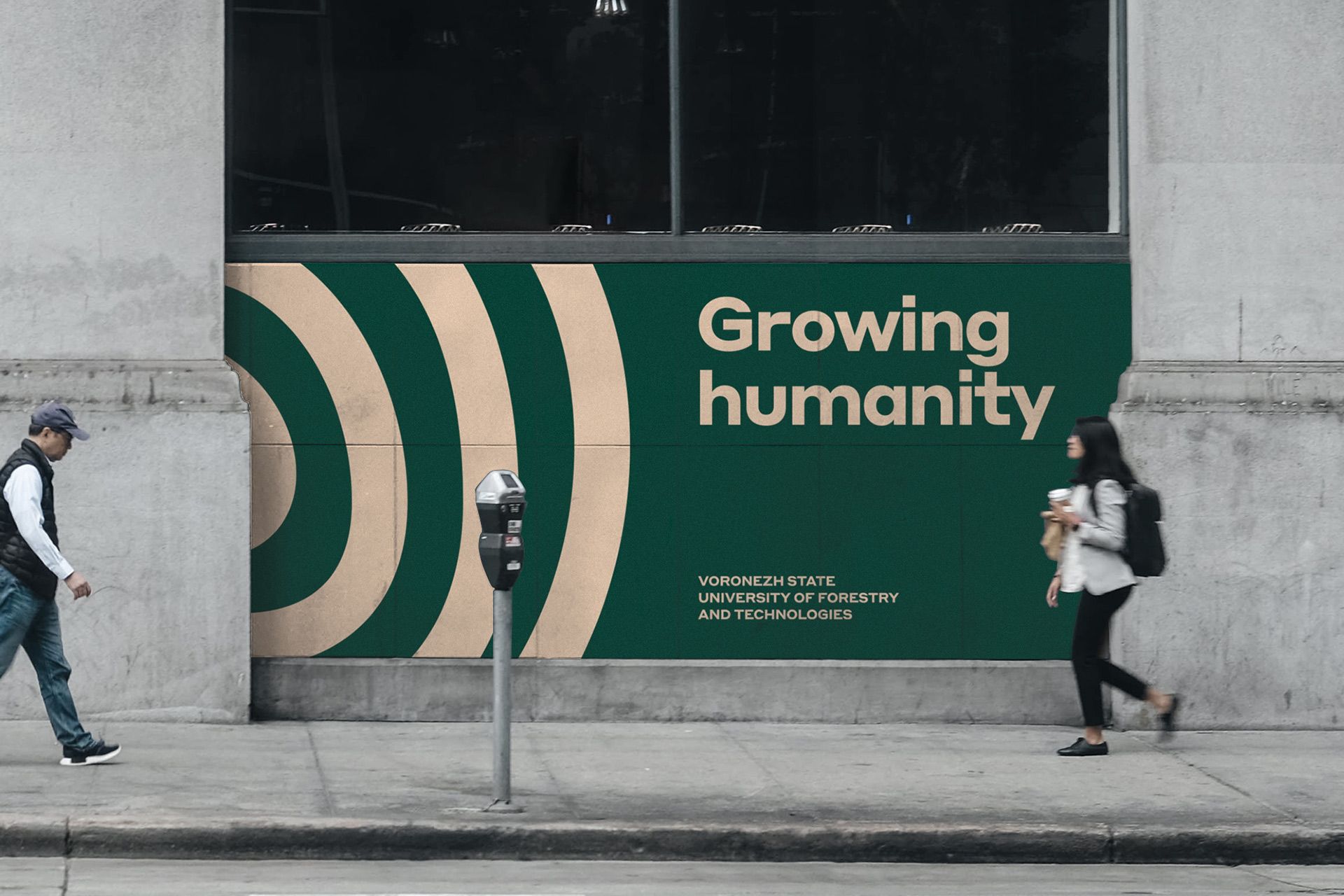
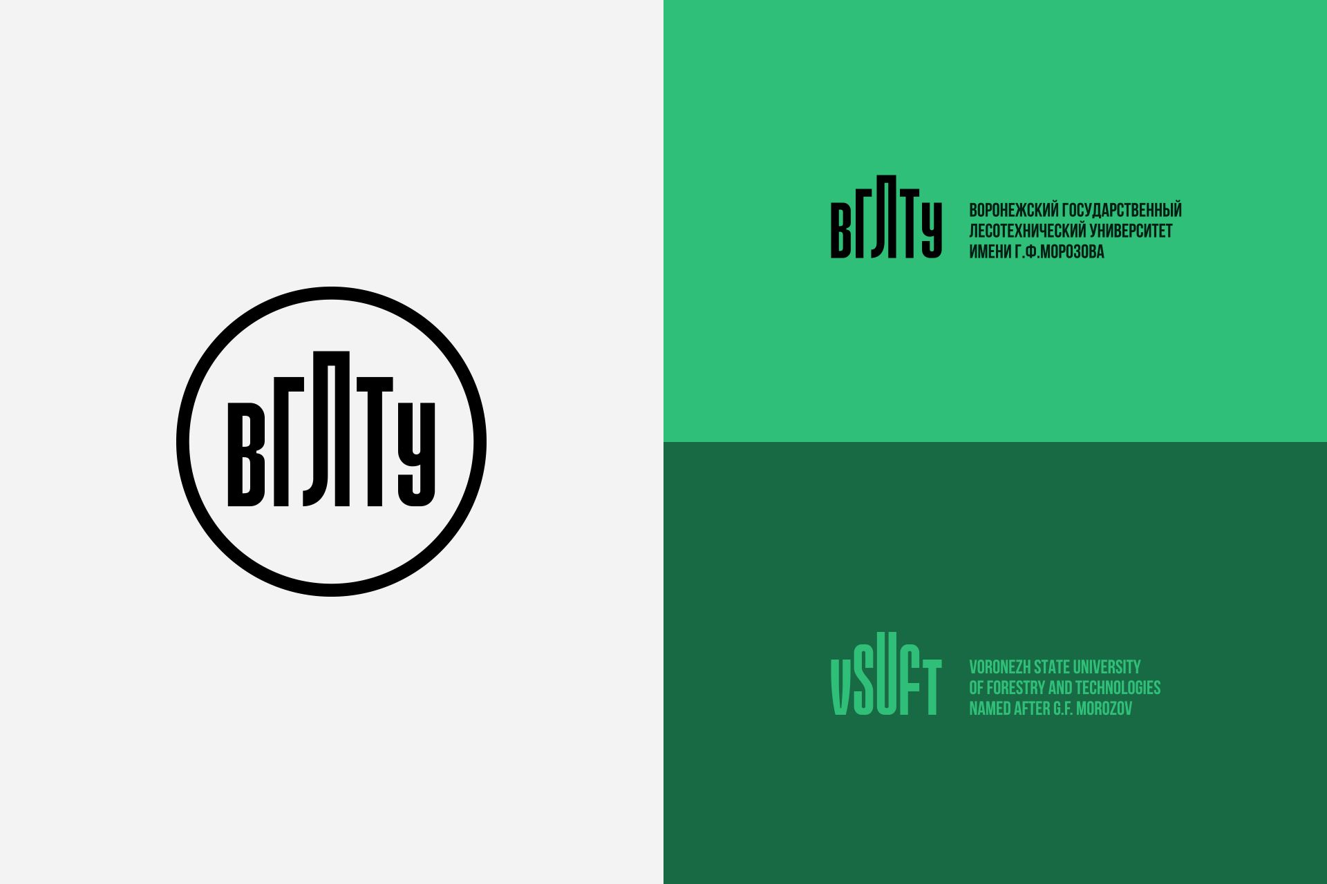
4. Growth
The avant-garde text sign references the typography of the 1930s, which is when the university was founded. The abbreviation, like the previous version, is based on recognizable architecture. Elongated letters resemble columns on the facade of the university building.
How did we look for ideas?
The new logo was supposed to carry a strong idea and serve as the keystone for internal branding, working for the interests of management, while also appealing to students who would see it every day. So, we needed to consider the key aspects of brand development in the edtech sector and how universities should build their brand identity.
Transform your educational platform like VGLTU. Partner with us to build a cutting-edge learning experience.
To create the concepts, we brainstormed and worked with ideas that correspond to this university and its areas of study. We searched in two directions:
- Evolutionary - orientation to the past, references to experience, history
- Revolutionary - orientation towards the future, references to technology and development
Many ideas formed at the junction of the two major focuses of the university: "forest" and "tech”. In the new logo, we wanted to preserve the duality that has accompanied the university for 90 years.
Art direction helped keep the focus on the strongest ideas, as we decided on the options we wanted to develop and prepared the first presentation for the university management.
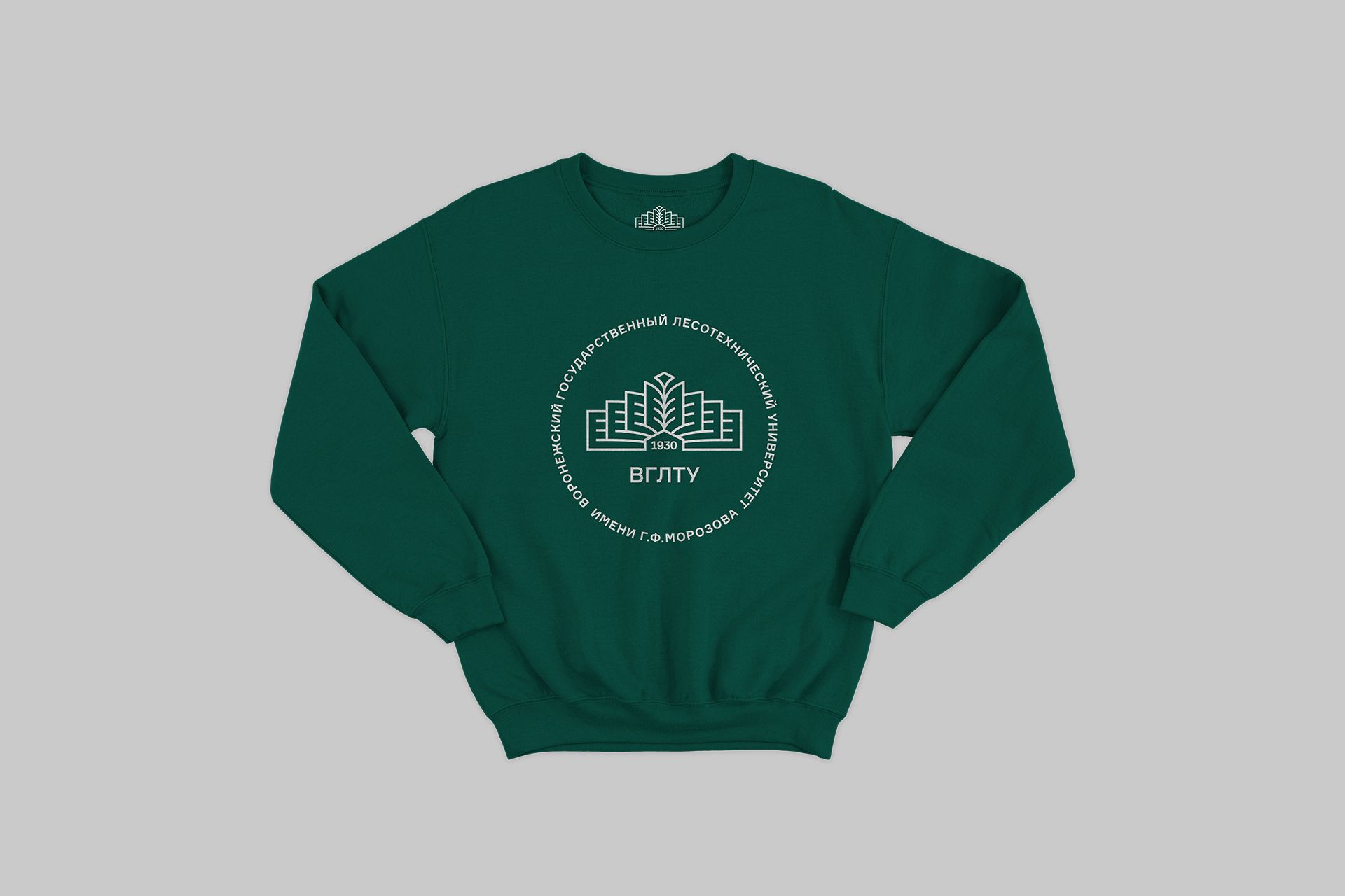
During the demonstration, we received good feedback, and management liked all of the university branding options. So, we needed to assess how these signs would work in reality. Everything looks great in digital form, but would the logos look good on letterheads and documents printed on a b/w printer? What about T-shirts or sweatshirts? How would they work on a small scale or scaled up to the size of a street banner?
At the second stage of work, we began to look for color solutions and formalized the original options, getting rid of weak elements and adding more clarity.
How did we choose one logo out of four options?
The principal of the university understood that one cannot executively choose an option and expect everyone to accept and love it. Therefore, the management decided to arrange an open vote to determine the winner.
For voting, we created a minimalistic website in Vue + Rails. To make the voting fair, users could choose the option they liked only by logging in through a Google or Yandex account. Authorization was implemented through OAuth2.
The website was executed using the colors of the logos themselves, so as not to distract from the comparison. The result was a fairly utilitarian solution that worked reliably and simply - users entered, logged in, voted, and left.
The voting itself took place in 2 stages, since in the first round, two options received almost the same number of votes. In the end, the Rings logo won, clearly showing that people were ready for a more modern option.
The contest and new logo were discussed and shared on media and social networks, so the university also received a fair amount of publicity from the change.
Plans for the future
We have a substantial amount of detailed work ahead of us as we proceed to transform the logo into a full-fledged corporate identity for the university. We will need to prepare different versions of the logo and finalize the rules for its use and language versions. Our task at this stage is to predict how the logo will work in different life situations, for example, things like student recruitment or edtech marketing. This will help the university independently use the logo and transform it for different needs.
The success of a new identity can be measured only over time and by indirect signs. Marketing in the field of education is complex. Rebranding a higher education institution takes time. You cannot just replace every instance of the old logo with the new all in one day.
However, the first telling result is the voting itself and the acceptance of the symbol by society. If they begin to use it, to reproduce it outside the media, then it was a success.
The rebranding of the VSUFT logo showed us that you can be bold in your designs, even if you are building a university brand for a school with a rich history. If you would like to work with our innovative design team, please contact us via the form below.
Client Review
In 2020, we celebrated the 90th anniversary of our beloved university. Our new corporate style is an encompassing, valuable choice for everyone. It was not just a vote, but a unique opportunity to influence the life of the university. Thanks to the Evrone design and development team for their good taste and deep involvement in the history of VSUFT and its culture.
Mikhail Drapalyuk