Learn to notice the invisible with UI Kids
UI Kids is a comic about important, but not always noticeable, interface elements with which the user interacts with the service. Evrone designers imagined what all these elements would be like if they were brought to life.
In this article we present a series of comic strips in which interface elements are personalized as characters. This creative approach emphasizes the importance of these elements in user interaction and demonstrates our design philosophy.
UI Kids is a comic about important, but not always noticeable, interface elements with which the user interacts with the service. These elements — buttons, tumblrs, checkboxes, etc. — allow the user to indicate their intentions and wishes, select the necessary options, and generally navigate the service. Evrone designers imagined what all these elements would be like if they were brought to life.
The idea
UI Kids was born from UI Kits — sets of ready-made solutions for user interfaces, which usually include buttons, menus, input fields, etc. This play on words prompted the idea to present these elements in the form of restless children with different talents and characters. And, of course, each of them has their own name and a unique story.
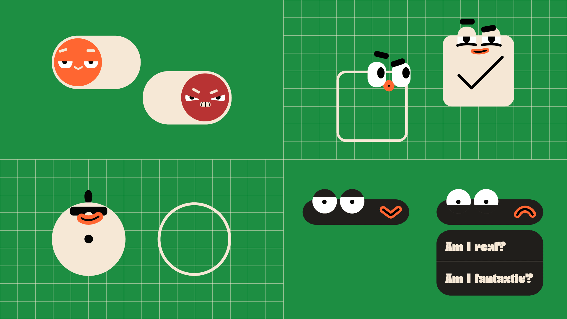
- Tumblroid — a tumblr. He’s a slippery guy. Capricious, constantly choosing between two extremes.
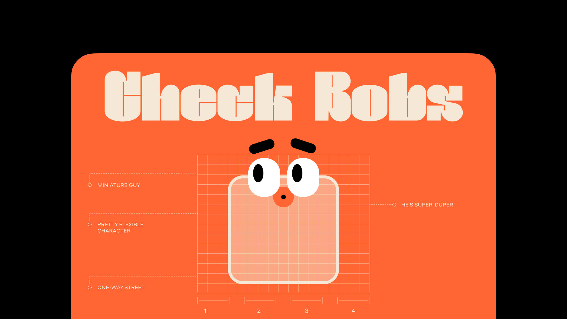
- Check Bobs — a checkbox. Small and easily lost, but can hide in the most unexpected places.
- Rob Down — a drop down list. The dark horse who hides much more than it might seem at first glance.
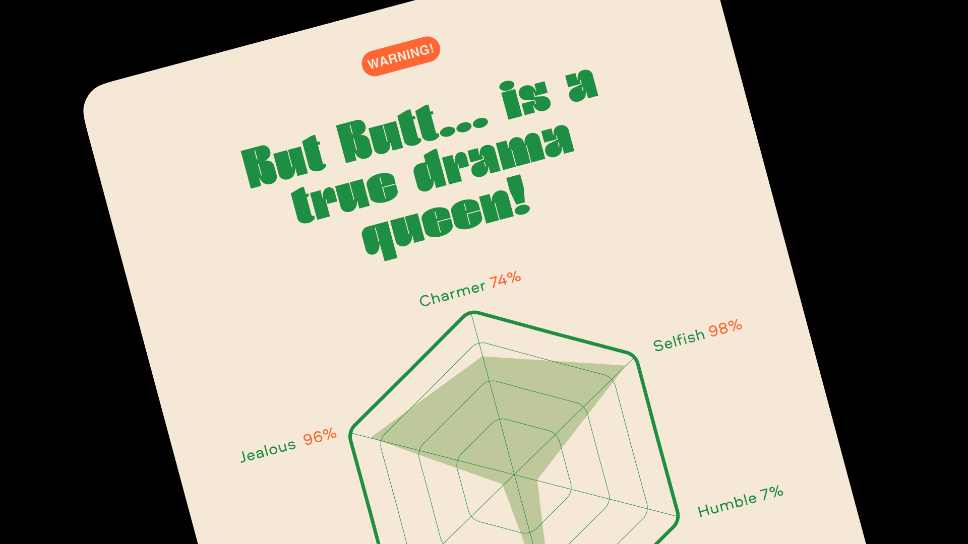
- Rad Butt — a radio button and half-sister of the checkbox. Modest, sophisticated, but loves to be the center of attention. A real drama queen.
- Click Clark — a button. The group’s leader. Irreplaceable, and knows it. Stubborn, but easily succumbs to pressure.
A bit of theory
At first glance, such interface elements do not invite much creativity. After all, the user must immediately identify them on the page and understand where to click. Their standard appearances were defined a long time ago and are firmly fixed in the memory of users, and this allows you to make interfaces native.
On the other hand, it is in such "cramped" conditions that there is a place for non-standard solutions. The size, color, and position on the page can change, and this is what sets the tone for the entire interface. The task of the designer is to build the system in such a way that the interaction takes place pleasantly and imperceptibly for the user, so that the principle of operation is read intuitively. After all, good design is inconspicuous design.
Animation also plays a huge role here: how smoothly the buttons can be pressed, how the lists unfold, how easily the tumblr slides. All this has moved into digital interfaces from the physical world, and the principles of operation have not changed much. Everyone is annoyed by sticky switches and non-functioning buttons, which can ruin the user experience.
Transferring pleasant tactile sensations from physical to digital requires precise calculation. For example, drop-down lists should unfold smoothly, but not too quickly for the eye to follow. Lines appearing out of nowhere are annoying, and overly fast effects will ripple in the eyes. Designing animation that is pleasing to the eye and brain is a real art.
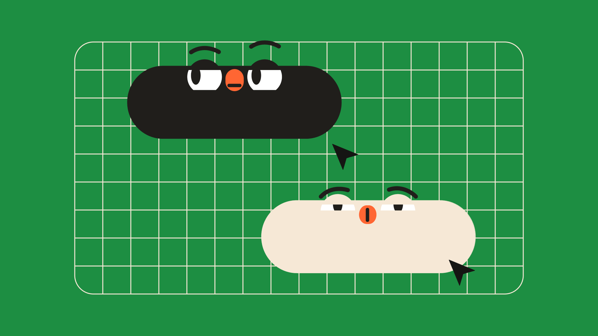
In the UI Kids project, we slightly exaggerated the animation. The characters not only move, but also demonstrate emotions. After all, each character perceives clicks differently: Tumblroid becomes furious, and Click Clark enjoys touches to the fullest.
UI Kids is part of a larger project in which we talk about interface design in an entertaining way. For example, Fairytale CJM talks about building a user journey map in a storybook format, and ORACULO helps train design thinking.
It is also a way to showcase the visual culture and graphic skills of Evrone designers. In real cases, it is not always possible to draw attention to what we really want to show. Plus, interfaces for internal services are often NDA protected. Therefore, comics are a kind of presentation of our skills and principles of work.
We at Evrone know how to create a pleasant experience that users want to keep coming back to. If you are looking for a design team that can develop a user-friendly, intuitive working interface, please contact us using the form below.
We deal with interfaces, and one of the ways we build communication with the user is through interactive elements. All of our online behavior is based on them, but they also have their own ways of behaving. With the help of the UI Kids project, we show that we know how to work with them and raise them (the UI kids) for you.

